Athleta Power of She Fund: A New Identity with Big Purpose
With the intent of making waves as a B Corp, I worked as the lead creative in partnership with the VP Creative Director to realize a new brand identity for Athleta’s Power of She Fund. As part of the larger Athleta brand ecosystem, it was important that the mark be sympathetic to the existing brand architecture and yet also stand confidently on its own to convey the importance of the mission and the company’s efforts to empower women.
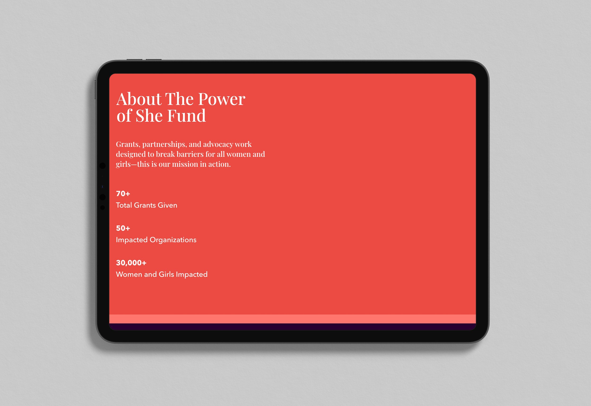
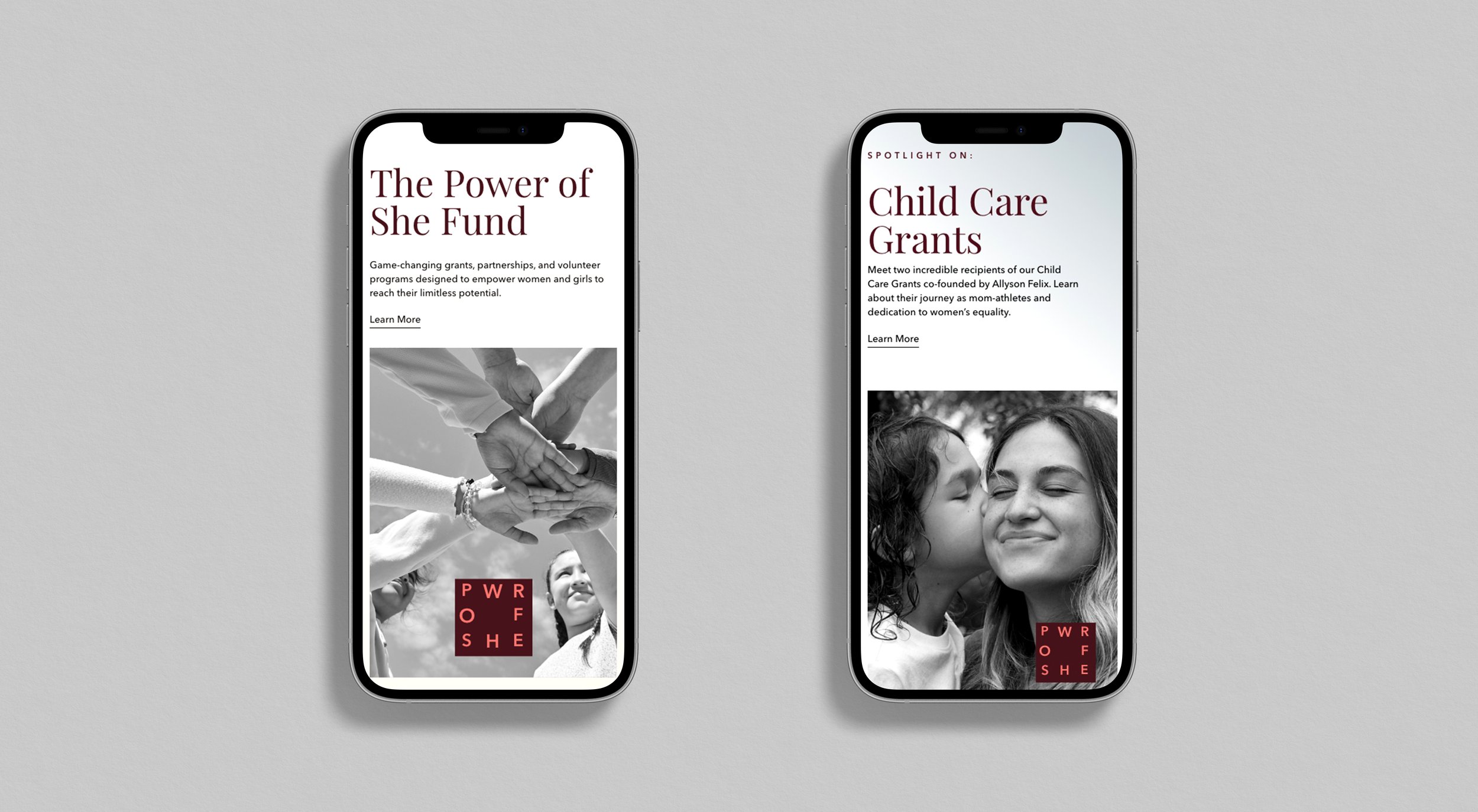
We landed on a flexible system, utilizing a primary square brand mark that could be paired with a typographic lockup or operate without depending on application. The color palette was designed to work with the overarching brand and have enough vibrancy and range to create a separate expression for the Fund as well. So that the mark could live harmoniously with brand product in-feed or onsite, I also built in flexibility with color application to allow the mark to exist as white over image or utilize soft gradient background values to blend well in complex digital environments.


